
UI for Arcade Gameplay
- Oct 20, 2016
- 4 min read

Taking a break from the controller design and previous topic of my last post, I have been focusing on screen layouts and placement of elements on various game screens. This includes playing with visual styles to match the intended feel and style of the rest of the scene and creating first pass assets for testing. The endless runner-arcade gameplay is considered the main form of gameplay in our game, and needs the most attention because it presents the most amount of information to the player at once. I have taken inspiration from various games for this:


Jetpack Joyride
Endless Runner


Canabalt
Simple Endless Runner


Super Flippin Phones
Simple Side scrolling Arcade-y Game (with slapping mechanics, heh)


Hotline Miami 3
Colour Scheme


Cruis’n USA
I played this game every time I went to an arcade back in the day.
Simple arcade racing game. Our game is to incorporate speed into the mechanics, and the racing game UI style is something I take inspiration from.
Implementation
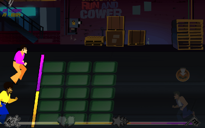
So, I started with this:

The design was created with these ideas in mind:
The whole screen is a comic panel and the horizontal aspect of most UI elements are to help expand the scene as the characters run towards the right, bumping into enemies
there are comic panels to represent the activation of power-ups or important events
the HP bar is clear and evident to represent the intended style and colour scheme
enemies are highlighted in the colour associated with the player so that each player knows which enemies are their responsibility
there are arrows above each enemy’s head representing the combination necessary for defeating them
ground enemies are divided into lanes to prevent clutter and overlap
the combo count is in the center of the screen for best viewing
Starpower and points are placed on the top for easy viewing

After testing and better ideas, changes needed to be made to this concept. Here were the considerations:
Since this is a 2 player game, players usually like to keep track of their own personal progress, usually in the form of combos so they now each have their own combo counter. The HP bar was kept to represent both players because it emphasizes cooperation and even if they had separate HP bars, they would still need to be dependent on one another due to the nature of the game.
The starpower bar was redesigned as a buddy meter and to emphasize the relationship between both characters.
Since players were only focusing on the area inside the player’s slap range, they did not notice the buddy meter or the HP. The game will provide whole screen feedback (ex: flashing red + screen shake + hurt character animations) and an active HP bar and buddy meter. Players especially need to be alerted when they take damage, when they receive a power-up and when they can unleash a special attack. The speed of the characters will also slow down and appear in distress when they are at low HP. HP is about equivalent to speed (negative feedback loop to keep players in the game).
The slapping range, or rather, WHEN the players COULD slap enemies was unclear in the prototype where there was just a semitransparent square as representation. My solution is that the active slapping area is highlighted (like the concept above)
The HP bar needs to be there even if the players will know the status of the characters by just looking at their appearance, animation and running speed; HP bars are more precise. The placement of this bar should be close to the player’s visual focus and can be on the top left or bottom left. To be tested.
The buddy bar, due to it’s nature, should be centered. It needs to be much bigger and probably the central focus of UI. It also needs to be extremely active and big enough for players to take notice. This includes animations to emphasize certain states
Some more topics came up when we were playtesting that required attention to UI and gameplay in general. Programmable and functional UI was not the main focus of the first prototype, which has shown that it is an urgent matter that should be implemented next for more valuable testing. Here were the concerns:
The few enemy types that were implemented overlapped because they moved at different speeds. This was confusing when the arrows above their heads overlapped. I propose that enemies will have 3 different heights that will dictate their speed and will prevent the overlap of arrows above their heads (small = fast, medium = average, big = slow). The medium enemies would be the most common to appear for less confusion.
There was only 1 lane per character where enemies would come down. We intend for the game to also have air born, gliding or flying enemies that are not restricted by lanes, so then which enemies will belong to which character when there are no distinguishing player lanes? Is 1 lane per character limiting and uninventive? I’ve played too many rhythm games that do this, and that’s not the experience we are going for. We wanted to take this perspective because it allowed for greater potential for on-screen action, especially coming from the right and top right.


The size of the slap range alters the game immensely. A smaller range means faster reactions, no overlap, planned and sequential enemy lineups to get to players, less enemy spawn points and lanes, and probably the most important: much less variation in enemy type because it will not accommodate longer combos or longer interactions with enemies; interactions almost have to be immediate. A larger slap range will allow for greater numbers of enemies to come towards the players allowing for a little bit more enemy spawn points and greater reaction times, not to mention more variation in enemies and longer interactions and combos. The players will be able to reach higher speeds and there will be greater variation between easy to hard difficulties (slower to faster) during one running sequence. You can see where I’m going.
We are still in the process of finalizing these final points. Enemy types, interactions, power-ups, star power among other topics will be highlighted in coming sessions. Here are some more sketches for fun.

Front facing boss battle perspective

Results Screen


Comments