
UX Design Focus For the New Year
- Jan 20, 2017
- 4 min read

For the first half of the capstone period, in my producer role, I focused my team to iron out general game design, mechanic and rule based systems without worrying too much about how players will perceive them. User experience has always been our team’s focus with Disco is Dead! in terms of genre and general experience. The more focused UI/UX details, however, were intentionally left for a later period to allow everyone on the team to focus on building the game’s basic structure. You may be asking: “Shouldn’t everyone be constantly attending to UX and UI details?” and my opinion is: yes and no. Yes, designers always need to be considering the player and the target audience when designing and producing a game, but when I describe the more ‘focused UI/UX details’ I mean the visual, audio, and sensory indicators. These additions make sure that players are 1) never confused, 2) are always aware of the game’s status and 3) are aware of their own status in the game. As the UI lead, I will be the one to head up this challenge.

In this Dev Log I will be sharing the details of my current exploration into parts of the game that I found needed UI and UX attention especially after the progress from the first half of the capstone year. At the end of the previous term, our game was evaluated by the professors and the team was given mainly UX and UI feedback, which is what I had expected to hear. We also conducted many playtests that gave us even greater insight into the features that would need to be added.


HP
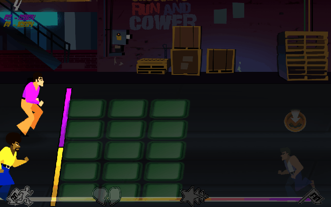
During internal and external playtests, the team had noticed that players would always be looking at the center of the screen, the area where the enemies were. While players were given an HP bar on the top left, they would never be looking there. Players were unaware of their status and were abruptly interrupted when the game would end once they had taken too much damage.
A negative feedback loop was originally incorporated into the design to make it more challenging as players had more HP and simpler as they had taken more damage. This loop would slow down the pace of the characters and enemies to allow the players to catch their breath while speeding the pace up and making the game more challenging when they were succeeding.
On top of this feature, I designed the HP to appear in the area with the enemies, right under their feet. This disco floor would act as a status meter to help players gauge their HP status. The meter would grow and change to green when they have a lot of HP and would fall to yellow and then to red when they lose HP, decreasing in size.

Cues
One of the most important aspects of games is relying on the player’s senses and intuition to react to cues in the game. Since our team has not focused on these moments up until now, it is my responsibility to ensure that all events are met with visual or audio cues.
Players need to know when they can interact with enemies. Once enemies enter the slap field, they are interactable and can be slapped. Currently, the uninteractable side (the far right) is darkened and dimmed while the rest of the screen is lit normally. Therefore, if the player can’t see it, they can’t interact with it. The darker side has proved to not be dark enough so the decision will either be to make it darker or remove the slap field altogether. It only increases the difficulty, but since the screen already zooms in and out to reveal more or less enemies (increasing and decreasing the difficulty) it defeats the purpose of the slap field almost entirely.
Players need to know the status of the buddy mode as well as how and when to activate it. Currently, there is a bar in the upper, center region of the screen that visually indicates the status of the buddy power. While the HP was not very noticeable, this was far more effective. The bar is small, but much like the HP, I plan to integrate it into the scene but in the same place.
Players should know how to slap when they see the directional icon above enemy’s heads. The icons currently are not animated. Some are one-hit icons and others are rapid-tap icons with a circular counter around them. I plan for these icons to be animated to indicate the means in which to interact with the enemy they are attached to. Combination (multiple icons in a row) will be smaller, rapid-tap icons will be pulsing and single tap icons will stay the same.
Status
Players should know when they take damage and that it has a negative impact on them. Animations should reflect damage being taken. The HP should also be clearly shown so that players are able to understand the consequences of their inaction.
Slapping
Slapping is the main theme of the game and all visuals and audio need to reflect this overarching theme. Animations need to reflect this action and enemies need to show comical reactions to it. This can be seen in cutscenes and arcade gameplay.


Tutorial
A very important feature of our game is to teach the player how to interact with the unique controllers. Each level teaches the player a new mechanic to defeat enemies while a general tutorial needs to be put in place at the very beginning to ensure that players are comfortable going forward. The tutorial is being designed to be discreet and written to match the style of the game. From previous testing, we noticed that players are able to understand the general rules of the game just by playing it. Therefore, a brief teaching period would be just to instill that initial confidence in players that they are performing in the proper way.


Comments