
Animations
- Dec 1, 2016
- 3 min read
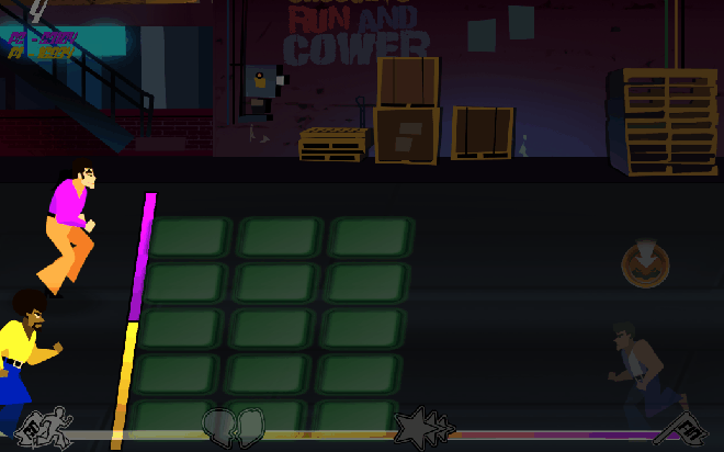
As the week drew to a close, the team was hard at work developing the final finishing touches for our GDC application. One of which was the implementation of character animations. I wanted to ensure that the animations followed the unique stylized look that we had established early in development, while maintaining the light-hearted theme of Disco is Dead! Consequently, I adapted a cartoony, lineless art style with exaggerated proportions and features. It was detrimental that the characters correlate with the 70s theme while looking fun, unique and pleasing to look at. Having the same zombie appear repeatedly throughout the game would be redundant and unoriginal; and thus, the zombies are designed with a variety of physical characteristics that reflect their behaviours, each with their own outfit and colour palette. For instance, I designed a police officer zombie carrying a riot shield for the enemies with extra health. This provides context for the enemy, and presents opportunities for interesting and dynamic gameplay scenarios.
Character animation is an exciting, but arduous task. In retrospect, I learned the importance of planning and storyboarding my scene before diving straight into animations. This allows me to identify risks and errors that could impede my workflow, and identify any potential design challenges. By gathering references and studying anatomy, weight and movement, I could create natural and believable character animations. However, it was difficult to match up the animations with the game’s side-scrolling layout. The main playable characters are constantly running to the right well the enemies walked to the left. Because the backgrounds were constantly moving as well, it appeared as if the enemies were walking in place or not moving at all. The simple solution was to adjust the speed of all elements so that the walk cycles felt natural and realistic.
Disco is Dead features many aberrant enemies. One in particular uses a “dodging mechanic” in which he switches between lanes to distract the players. For this character, I animated a zombie that flips in the air to signify the lane-change. However, this deemed problematic; the animation was obscure and took too long to finish in the short amount of time available. This character would have to be redesigned so that its behaviour is more obvious and players can immediately distinguish and anticipate their moves. I will design him in rollerblades to match the 70s theme.
Quick splash animations were useful in providing feedback every time a player hit a zombie. Additionally, each attack animation was equipped with a “slash” effect that felt satisfying to the player. Using the 12 principles of animation, I was able to breathe life into the characters. The main principles I used are as follows:
Anticipation – Anticipation is used to let the audience know that a major action is about to take place. The “dodging” zombie pounces forward before breaking into a midair flip.
Straight Ahead and Pose to Pose – Straight ahead and pose to pose refers to the techniques by which animation is crafted. The pose to pose technique involves drawing the key poses that I’d like the character to take first and then filling in the transitional poses second.
Follow Through and Overlapping Action – The follow through principle argues that when a character is in action and stops, nothing stops all at once. So when a character is running and stops, their main body will stop, but the other parts of their body will keep moving for a bit after.
Slow-In and Slow-Out – Slow-in and slow-out is another principle designed to add realism to the movement of characters. When characters are performing actions, animators will draw more frames at the start of the action, less frames in the middle, and more frames again at the end of the action to create this slow-in/slow-out effect.
Exaggeration – Exaggeration is all about overstating certain movements in a way that helps evoke a point, yet doesn’t ruin the believability of the scene.
Solid Drawings – This principle encourages animators to be mindful of the fact that while forms may be presented in 2D, they should strive to look 3D. With the zombies, despite being drawn in 2D, through the animation choices we as an audience feel that they have weight and are three-dimensional.
Background Elements


Comic-Cutscenes


Comments